How to Create Social Media Images for Your Awards Marketing That Aren’t Lame
Visual content is all the rage now. And with that comes that same bit of advice over and over for your social media marketing: Make it visual.
As social platforms turn to focusing more on images, we keep hearing with even more frequency to keep our posts visual. Want people to stop and read your post? Make it visual. Want it to be shared? Make it visual.
Heck, even we’ve said it.
But, that’s easier said than done. Not everyone is a graphic designer, so saying “make it visual” isn’t always the most helpful phrase. Sure you’ve got a social media strategy for your awards marketing, because you’re hard-working and dedicated to making your awards program a success. But maybe you’re a little stumped about how to turn those snappy tweets you’ve got prepared into more “visual” messages.
Well, today we’re going to make it easier, by showing you how to turn your social messages, like tweets, into dynamic images. Hopefully by examining the images below and following some of our tips, it will give you some ideas of how to step up your “visual” game (and what to avoid).
To get started, here are some basic best practices when sharing images on social media:
1. Keep it simple – Yes, it’s an image that’s meant to capture your followers’ attention. No, that doesn’t mean it should be cluttered with tons of colors, graphics, and memes. The rule of keeping a lot of “white space” still applies for images. Having too much going on in one image will looks cluttered and will detract from the message you’re trying to relay.
2. Make it pop – However, just because you want to retain white space in your image, doesn’t mean you should sacrifice any interesting elements. You should still make your image pop. Maybe that’s with a fun graphic, a neat font, or a bold color. Find some way to make it eye-catching without over-cluttering.
3. Keep to your awards brand – Some level of consistency is important when it comes to design. You want your social media images to be unique and exciting, but you also still want them to relate to your awards program’s brand and other awards marketing materials to help identify and associate it with your program. That can mean anything from using the same color scheme from your logo, including your logo, or using a consistent filter/style with your images.
4. Keep the message short – Remember: this is an image being shared on social media. While you want to relay some sort of information to your followers, this isn’t the time to share a paragraph of text. Keep it short and pithy, and let the image do the talking.
5. Use appropriate dimensions – Whatever social network you’re sharing your image on, make your image fits to the optimal dimensions for that network. If you don’t, parts of your image could be cropped, or it could get stretched and blurry. Talk about unprofessional. Check out this helpful post from Sprout Social for a more in depth look at social media image dimensions.
6. Have fun with it – Don’t get too caught up in trying to make it perfect. Do something fun that has some interesting elements and then go ahead and send it out. If you spend your entire day tweaking it to “perfection” you’ll never get anything done. And with each post you’ll learn a little bit more and improve your next image.
So now let’s take a look at two images made for Twitter (with a silly, made-up awards program) and how they hold up our best practices.
First up:
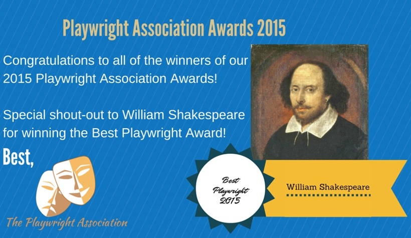
My first thought looking at this image is: yikes. There’s a lot going wrong here. Is it getting the point across? Well, yes. But is it a good, successful image that is likely to get some recognition on Twitter? Not really, no. So what specifically is wrong with it?

1. There’s way too much text. While it seems the real purpose is to congratulate one winner, the “association” decided to also congratulate everyone else, as well as adding the name of the awards program, and the redundant information below the Shakespeare’s picture. It ends up looking messy.
2. There are a lot of inconsistencies here. In one image they’ve managed to use five different fonts (including the one from their logo). Using so many different design elements keeps the image from having any kind of cohesion. You’re better off to use one or two fonts that work well together and leave it at that.
3. There’s way too much going on. With the large logo, the big picture that doesn’t feel integrated, the “ribbon” below it, and the striped background, your eye doesn’t know where too focus. The image looks too busy and messy.
4. It’s the wrong size. The image is too small and the wrong width for an optimal Twitter image.
Well, now that we know what not to do, here is a new image relaying the same message.
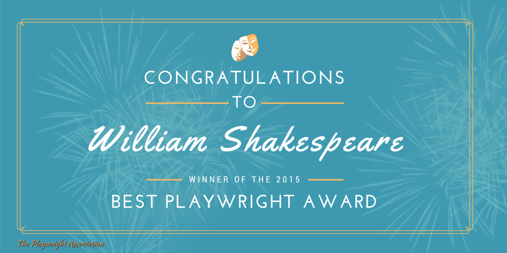
This image is far more successful than the first attempt. It removes the extraneous text, sticks to a couple of complementary fonts, and manages to both incorporate the logo of the “association” and use its color in the design of the rest of the image. It also manages to look celebratory while embracing white space around the text. Oh, and the dimensions are optimal for sharing on Twitter.
And there it is! Once you know what to avoid and how to fix easy mistakes, making an image doesn’t seem so daunting. As for the actual designing, there are a lot of free resources online, like Canva, to help you make good images. You can also download our Social Media Toolkit that includes social image templates to help you get started!

[button id=”” style=”” color=”orange” type=”large” size=”large” href=”http://www.getopenwater.com/subscribe-to-openwater-blog” align=”center” target=”_self”]Like what you’ve read? Click here to subscribe to this blog![/button]

Making the Most of Your Awards Call for Entry
The Importance of Showcasing Your Awards Judges [In Under 100 Words]
Filter resources
Explore Posts by Topic
Best Resources
The Ultimate Guide to Awards Management