The Secret to Creating an Amazing Facebook Cover Photo for your Awards Program [+ Examples]
With about 1 billion active users, Facebook use has become almost a daily activity for people and organizations alike. Most organizations have fully optimized profiles and are using Facebook to connect with and attract followers, sharing relevant industry information and news about the organization itself.
Awesome!
But when your awards program rolls around there’s more you can do to attract followers and encourage submissions than just posting your press release. You can tweak some visual features of your page to promote and market your program. This is done easily and effectively with your cover photo.
The purpose of a cover photo is to “feature a unique image that represents who you are or what you care about,” according to Facebook.
But why is this an effective way to market your awards? Not only does the cover photo make a statement, it’s the first thing we notice when visiting a page. After all, it takes up about ¼ of the screen. If your cover photo is marketing your program people will take notice and if you do it well, they will want to learn more.
Follow these tips to make your awards cover photo one for the books:
- Keep it simple. Yes, it’s the first thing a visitor will notice. Yes, you want it to be eye-catching and memorable. But that doesn’t have to come at the cost of simplicity. A cover photo packed with graphics and quotes and colors can alienate and discourage a visitor from investigating. If there’s so much going on they don’t know where to look, chances are they won’t look at all. Choose which elements you want to include most in your photo and save the others for another image.
- Use the appropriate size when designing your cover photo (optimal dimensions are 851 x 315 px). You want to be able to show off the entirety of your image when you upload it. Making it too big will force you to crop some from view and making it too small could stretch it or leave blank spaces, which looks unprofessional.
- Account for your profile picture and the space it takes up! It would be a shame to design a really cool graphic and have part of hidden by your profile picture. And with that in mind …
- Give the center and right side some attention. Align your image to the right or center of your cover photo’s space. This will help to avoid losing part of your image behind your profile picture and also give a better flow to the image. The presence of your profile picture on the left side already draws the eye and bunching most of the action of your cover photo on the left will make that side look cluttered, preventing the eye from looking at the rest of the image.
- Include a call to action, but keep it visual. Having a call to action is great because it draws the viewer in and sparks interest. This can be anything ranging from a statistic about your program, your motto, or simply the name of your program and the entry dates. But don’t forget that this is an image, so allow most of your cover photo to remain visual. Using a great photo or designing a cool graphic can just as effective as a piece of text.
Now that you’ve got those down, here are just a few examples of awards programs that are following the tips we gave with awesome results:
- The Academy
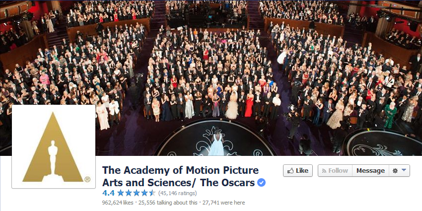 I know I just used The Academy as example in my post about twitter, but I can’t help it that their social media is so on-point.This photo is subtle and fantastic, giving an overhead view of a moment at this past Oscars ceremony: Lupita Nyong’o receiving a standing ovation after winning Best Supporting Actress in “12 Years a Slave” (as the caption tells us). By showing the crowd of people instead of the stage, you feel excited. It’s a room packed full of people celebrating the year’s best movies, and it makes you want to celebrate too. With a powerful image like this you don’t even need text.
 - The CLIO Awards
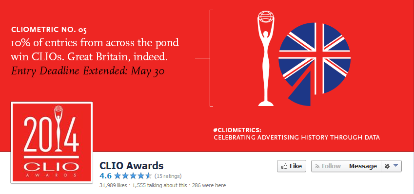 The CLIO Awards really nailed the concept of simplicity and incorporation of text. Using the red background is a pop of color that allows their profile picture to blend in with the cover photo, allowing the eye to focus on the stat.
The statistic is short and pithy and is supported with a cool, patriotic pie graph. I love that they include a specific hashtag and use a term like “Cliometric.” The fact that the graphics are on the right side of the page with the text above the profile picture allows for a nice flow that lets the eyes explore the whole image without getting caught up on one side or the other.
- The HUMANITAS Prize
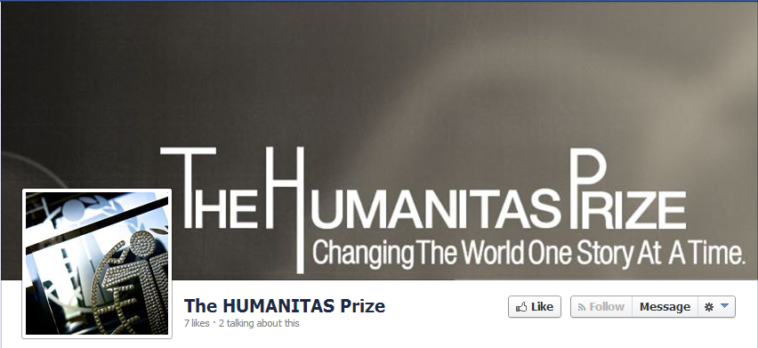
The HUMANITAS achieves a killer take on subtly that is both attractive and memorable, even in grayscale. Keeping the text to the lower half of the photo, in line with the profile picture and complements the simplicity of the gray image.
This cover photo relies on text to be memorable. The font is eye-catching, without contrasting greatly from the background. The quote, even though it’s the smallest element of the photo, packs the punch. It’s short and to the point and drives us to act. It makes you want to be a part of something that is changing the world.
Ready to create your own awesome cover photo? Download our Social Media Toolkit that comes with image templates for Facebook and Twitter to help you get started!

[button id=”” style=”” color=”orange” type=”large” size=”large” href=”http://www.getopenwater.com/subscribe-to-openwater-blog” align=”center” target=”_self”]Like what you’ve read? Click here to subscribe to this blog![/button]

1 Simple Trick to Make Your Awards Program Go Viral through Social Media
5 Examples of How to Use Twitter for your Awards Program
Filter resources
Explore Posts by Topic
Best Resources
Awards 101
The Ultimate Awards Program Prep Checklist