What Makes a Good Awards Website?
A few weeks ago we took a look at 21 different awards websites that really stood out from the crowd (check it out if you haven’t already!). Recently I was thinking about them again and why exactly I picked them to be in the top twenty-one.
So this week I decided to select a few of those twenty-one and take a closer look at them and share exactly what it is that makes them so great.
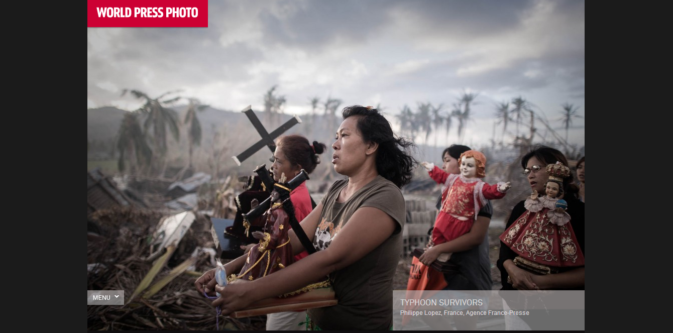
Visiting the World Press Photo site is immediately arresting. In their “About the Foundation” section it says, “We exist to inspire understanding of the world through quality photojournalism.” The website perfectly encapsulates its belief in the power of photography. Photos take precedence throughout the whole website with extensive, well crafted galleries.
What I like so much is that World Press Photo took what they’re all about and made their website reflect that. It all works together to make an interesting, comprehensive, and visually stunning website.
2. San Francisco World Spirits Competition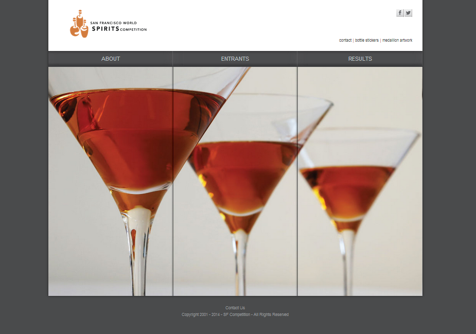
Clean, sleek, and simple. My favorite kind of website. In fact, I just can’t get over how much I love this site. What makes it so cool is that big image. Sure, it’s a great photo, but it’s divided up into a triptych! Hovering over each panel will reveal text with information for each menu item above the panels. (You can also click on the menu tabs for more information.) So neat!
The folks at the San Francisco World Spirits Competition found a clean, innovative way to present information on their website. You don’t even have to leave the homepage to get the information you need, but the page remains clean and not cluttered with text.
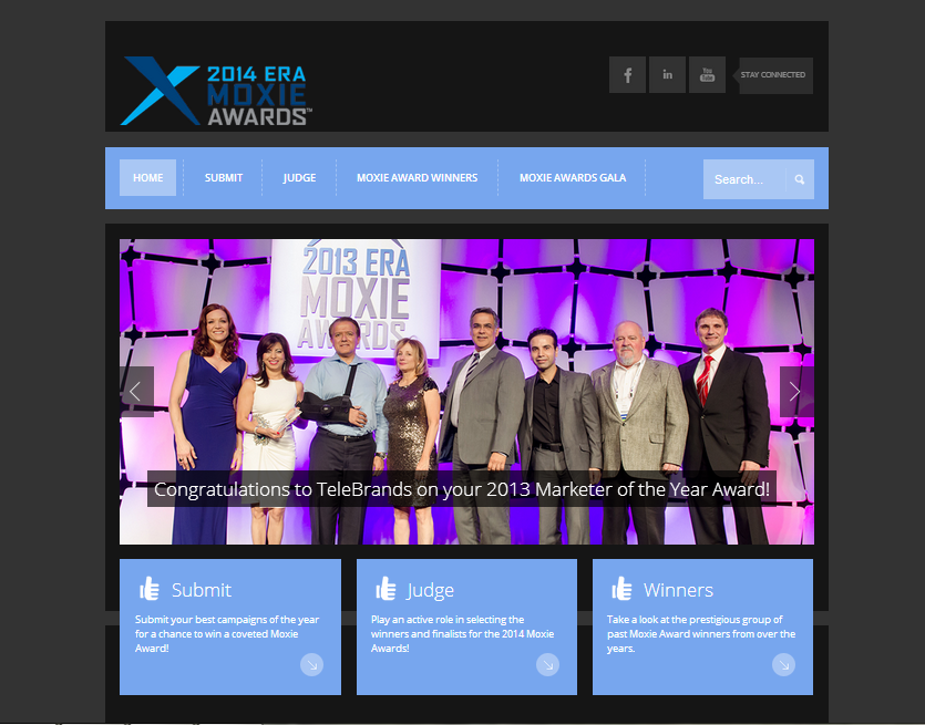
The Moxie Awards website is immediately appealing to look at. The layout is perfectly organized, the color scheme is interesting, but subtle and they’ve got a great series of rotating images to interest the viewer. There’s a lot of information present on the homepage (and the whole site) and I was impressed by how it still didn’t feel overwhelming to look at. Props!
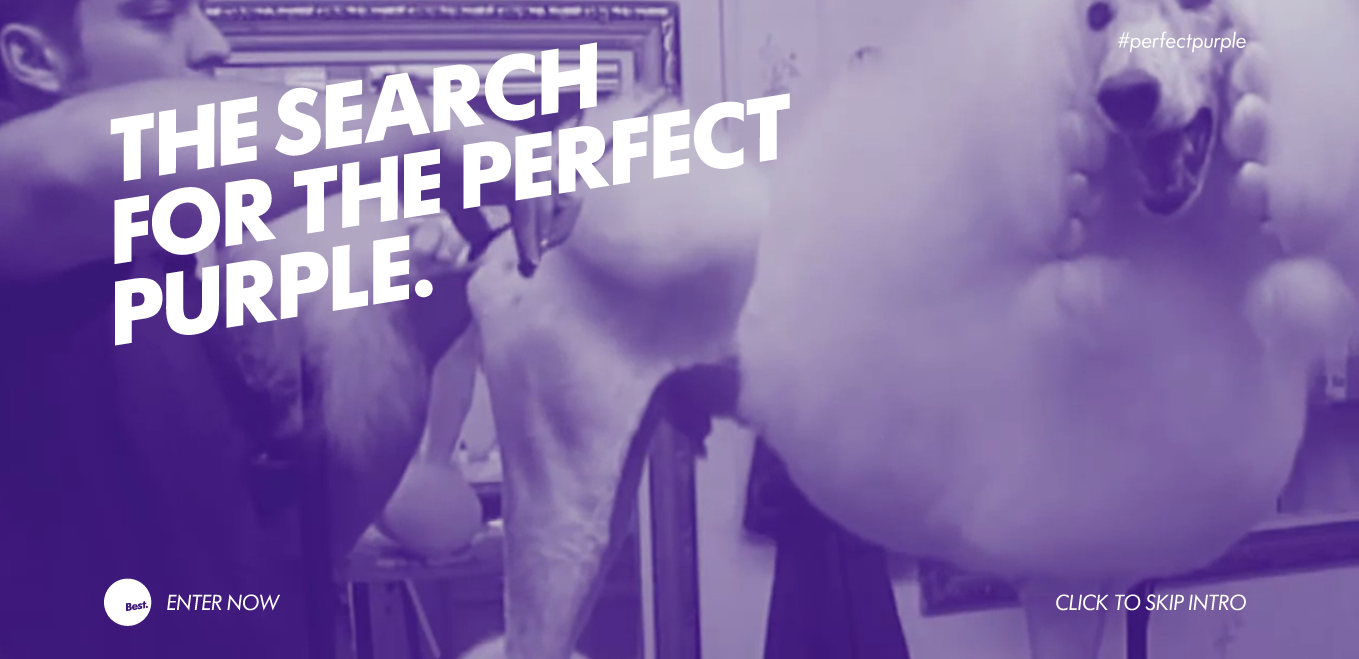
The New Zealand awards program “is the annual showcase of excellence in graphic, spatial, product and interactive design.” What appealed to me most about their website is the intro video. It’s just so silly, showing someone primping a poodle, yet oddly appropriate. It sets the tone for the awards and is super memorable. Note also the use of an awards-specific hashtag!
All four websites found an interesting and unique approach to their websites, utilizing visuals, information, and layout to the fullest.
Have a cool awards website you know about? Share it with us in the comments!

[button id=”” style=”” color=”orange” type=”large” size=”large” href=”http://www.getopenwater.com/subscribe-to-openwater-blog” align=”center” target=”_self”]Like what you’ve read? Click here to subscribe to this blog![/button]

Different Ways to Use Email Marketing for Your Awards Program
14 Mind-Blowing Ad Designs for Awards
Filter resources
Explore Posts by Topic
Best Resources
Awards 101
The Ultimate Awards Program Prep Checklist