Better Legibility and Cleaner Fonts
You may have noticed something is a little bit different when you logged in. We did a complete overhaul on some of the key UI elements of the OpenWater administrative portal. Many elements of the backend date back to the state of the Internet back in 2007. We continue to make incremental updates.
Switch to Open Sans from PT Sans
The fonts everywhere should be a bit easier on the eyes. With PT Sans we needed to use a size 14 font, where now with Open Sans we can use 12. This let’s us fit more on the screen while keeping things crisper.
Left Alignment on Tables
Before we center aligned all text in tables. This would make it hard to compare two pieces of information that had drastically different letter counts.
Light Blue Colored Hyperlinks
Hyperlinks were known to be a real deep blue color since 1994. With the lighter themed website we wanted to create a refreshing look. Our new blue matches the hues of the OpenWater brand.
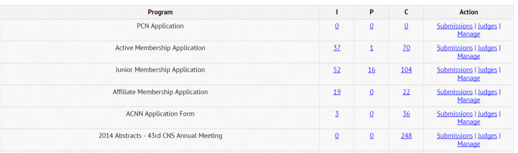
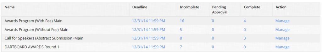
The Results
The old view
The new view

Let us know what you think of our design changes in the comments below. If you have any suggestions feel free to email your support representative.
Let us know what you think of our design changes in the comments below. If you have any suggestions feel free to email your support representative.

How to Find the Right Judges for Your Awards Program
5 Examples of How Facebook is Used for Awards
Filter resources
Explore Posts by Topic
Best Resources
The Ultimate Guide to Awards Management