How to Create the Perfect Twitter Header for your Awards Program [+ Examples]
A couple of weeks ago we learned how to make a great Facebook image for your awards program and I thought, well what about Twitter? With the new layout they’ve got there’s a whole new way to think about your twitter header. So let’s dive into how to make one for your program that stands out from the crowd.
It’s almost overwhelming how many people are active on Twitter (over 250 million!) and a lot of those are organizations with awards programs trying get the news of their awards out there. But with all those users sending out around 500 million tweets every day it may seem difficult to stay on people’s mind and get the amount of engagement you want.
Don’t despair! There are ways to market your awards program through twitter without tweeting every two seconds. One way to do this is through your profile, specifically your profile header.
Back in April Twitter updated the format of users’ profiles. Among the updates, they gave each profile a much larger header photo. Twitter says, “Your Twitter profile shows the world who you are — moment by moment. New web profiles make it even easier to be yourself.”
Take the opportunity this new, expanded photo is giving you to “show the world” what your program is by crafting a cool profile header about your program. It’s a great way to market your awards program because you have a bigger and better chance to make a good first impression on viewers, to tell a story, and emphasize the importance of your awards.
Before you start creating, take a look at some of these best practices to follow in order to make the most of your twitter header.
- Be aware of your image’s resolution. No one wants a blurry picture! It’s just not professional. A lot of profiles haven’t updated their photo from the previous size and are now displaying stretched, pixelated photos. Set yourself apart from the crowd and show how savvy you are!
- Keep cropping in mind. Be mindful of the parts of your profile that will block your header: your profile photo and the top and bottom bar. You don’t want to go through the work of creating an awesome header and then have a section of it not even visible.
- Use the appropriate size when designing your header (optimal dimensions are 1500 x 500 px). You want to be able to show off the entirety of your image when you upload it. Using the wrong size will force you to crop some from view or cause the image to stretch or leave blank spaces, which looks unprofessional.
- Focus on the center and right side. As on Facebook the presence of your profile picture on the left side already draws the eye and bunching most of the action of your cover photo on the left will make that side look cluttered, preventing the eye from looking at the rest of the image.
- Include the hashtag of your program. And if you haven’t made one yet, for heaven’s sake, get on it! Using a hashtag when talking about your awards on twitter will create buzz and help followers to engage with you. And it helps you keep an eye on what people are saying about your program!
- Keep it simple. While it is the first thing people will notice and makes a larger impact than ever before, you don’t want to overwhelm your followers. If there’s so much going on they don’t know where to look, chances are they won’t look at all. Choose which elements you want to include most in your photo and save the others for another image.
Now that you know what to keep in mind, let’s take a quick look at some examples of organizations using their twitter headers to market their awards:

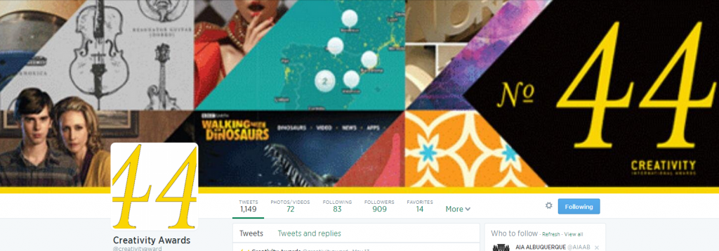
This header is just really neat. It’s got several images with lots of different colors and patterns to catch the viewer’s eye, but it doesn’t overwhelm. I love the black arrow shape that tells you what the awards program is and what year they’re in. The fact that the images are cropped in line with the arrow gives a nice continuity to the image that draws the eye across the whole length of it.
As much as I like this image, I do have one quibble: it’s blurry. If the resolution of the image could be readjusted to accommodate the new size of the twitter header this image would be killer.
2. Cannes Lion

The simplicity of the Cannes Lion poster is just awesome. It’s got the nice clear blue that blends the profile picture with it and then the 3 geometric shapes throughout to make it pop. Though there’s not a lot going on, it’s visually very appealing.
I also like the use of the sans serif font announcing the name and the dates. If only they’d added a special hashtag for the awards! Can’t you see how nicely it would fit next to the date? *sigh*
3. Canadian Medical Association

The CMA header has it all: a really neat image, the name of the event and date in English and French, and its own hashtag! The blue of the texts echoes nicely the graphic in the profile picture and the soft gray of the background image compliments it while not overwhelming the eye. The only adjustment I would make would be to place the image on the right side instead of the left. The profile picture crops part of it and makes it look less clean. One tweak and then it’d be perfect.
Ready to start your own design? Download our Social Media Toolkit that comes with image templates for Facebook and Twitter to help you get started!
Got a good twitter header for your program or know of one? Share it with us in the comments!
[button id=”” style=”” color=”orange” type=”large” size=”large” href=”http://www.getopenwater.com/subscribe-to-openwater-blog” align=”center” target=”_self”]Like what you’ve read? Click here to subscribe to this blog![/button]


