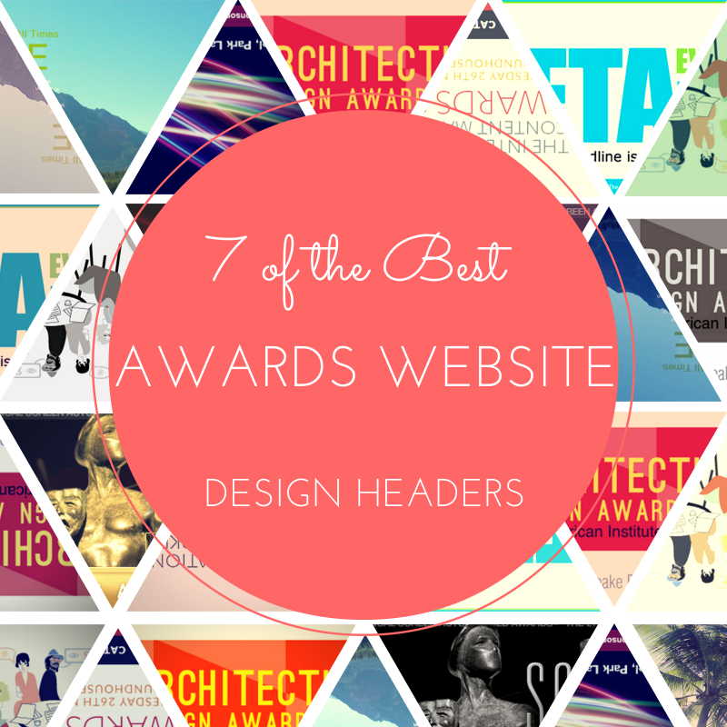
7 of the Best Awards Website Header Designs
To put it simply: your awards website is important. Not only is it the source of information concerning your program and the point from which people can apply, it’s also your program’s first impression. When visiting your site, the layout of the website and its look is the first thing they notice, so obviously you want to make a good impression. Your website should be visually interesting, reflecting accurately both your awards and your organization. One way to do this is to have a cool website header design highlighting your awards program.
Here are 7 different awards programs that have nailed it and what I think makes them interesting.
- AIA Maryland
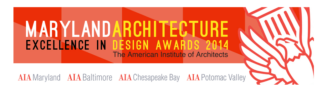 I really like this design because while it looks simple, there’s a lot going on. The colors, font, and graphic all work together nicely without overpowering each other. The subtle imitation of the Maryland flag (the font colors and checkered background) is a nice touch. But my favorite part is the large overlaid AIA graphic that comes in at an angle; it completes the header, making it fresh and interesting.
 - AV Awards
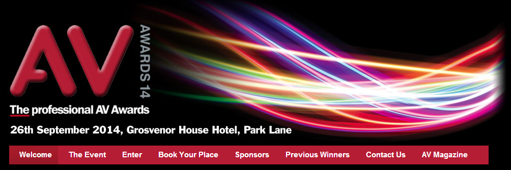 The AV Awards celebrate excellence in the Audio Visual industry and knowing that one realizes why this header is so awesome. The simple graphic and brief information in a sans serif font on the left, along with the black background, allow you to focus on the coolest part about the header: those cool wavy lights. Not only are they visually interesting and appealing, they’re also subtly reminiscent of light and sound waves. Get it? How cool is that!
 - The International Content Marketing Awards
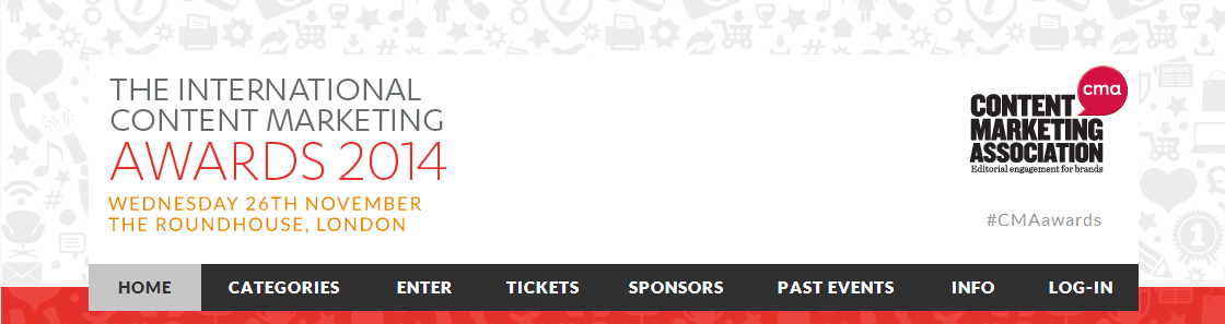 I really like how CMA manages to create such a clean looking header that still has so much going on. The key to achieving this same look is keep a consistent color scheme and taking advantage of white space. Though the background of the header has tons of icons relevant to the values the program celebrates, the white rectangle laid on top of the background provides enough white space to keep it from looking overwhelming.Besides the use of a compilation of icons (which reminds me of I Spy books, which I always thought were super fun) my other favorite thing about this header is the inclusion of a personalized hashtag for you to use to talk about the event. In fact, this whole website is pretty neat, you should check it out.
 - The American Advertising Awards
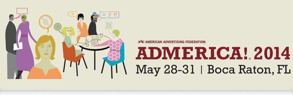 Now this is just cool looking. The American Advertising Awards “represent the true creative spirit of advertising by recognizing all forms of advertising, from all types of media, created by all sizes and types of entrants, from anywhere in the country.”What makes the illustration featured in their header so cool isn’t just its unique look, it’s all the speech bubbles and different people that seem to represent and illustrate the things AAF is celebrating with this awards program.
 - Mahathir Peace Award
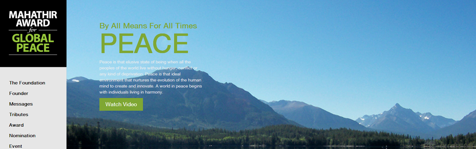 The Mahathir Peace Award honors people’s efforts to promote peace and harmony throughout the world. The header for their website is so effective because it focuses on the idea of peace. This is achieved by a poignant definition of peace coupled with a landscape shot. The photo of the mountains is unexpected considering the focus of the award, but definitely a scene that everyone can find beautiful and peaceful.Another standout feature of this header is its inclusions of a call to action to watch a video. This is memorable because it’s engaging with viewers from the very beginning and is a simple way to learn more about this award.
 - Screen Actors Guild Awards
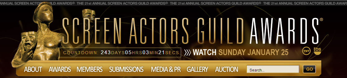 There’s so much cool stuff happening with the SAG’s header. There’s a lot going on but the continuity of the font and colors keeps it from looking overwhelming. The statue placed in such an imposing, almost life-sized manner is really impressive.However, the reason that I picked this header as a standout is the inclusion of the countdown. Countdowns are a great way to build hype and excitement, increasing anticipation for the visitor. This is a great idea for an awards program whose gala isn’t coming up for a while to keep the event top of the mind for applicants and interested parties.
 - Event Technology Awards
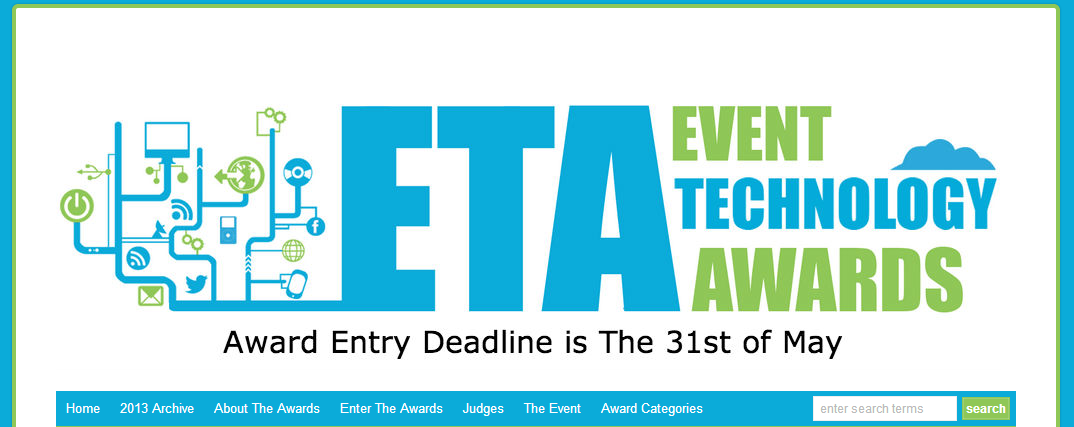 The Event Technology Awards’ header is great due to it simplicity. I like that they stuck to two colors for their graphic and the text for the Awards name. Having the graphic of the technology and event related icons merge with the name of the awards gives a nice flow layout. Also, even though it’s such a simple, small thing, the cloud image above the word “technology” brings the graphic elements on the left full circle, making the eye look at everything. This shows that you don’t have to have a lot going on to make something neat and eye-catching. Does your awards website have a cool header? Share it with us in the comments, we’d love to see!
[button id=”” style=”” color=”orange” type=”large” size=”large” href=”http://www.getopenwater.com/subscribe-to-openwater-blog” align=”center” target=”_self”]Like what you’ve read? Click here to subscribe to this blog![/button]

Why Social Media Matters for Awards
1 Simple Trick to Make Your Awards Program Go Viral through Social Media
Filter resources
Explore Posts by Topic
Best Resources
Awards 101
The Ultimate Awards Program Prep Checklist